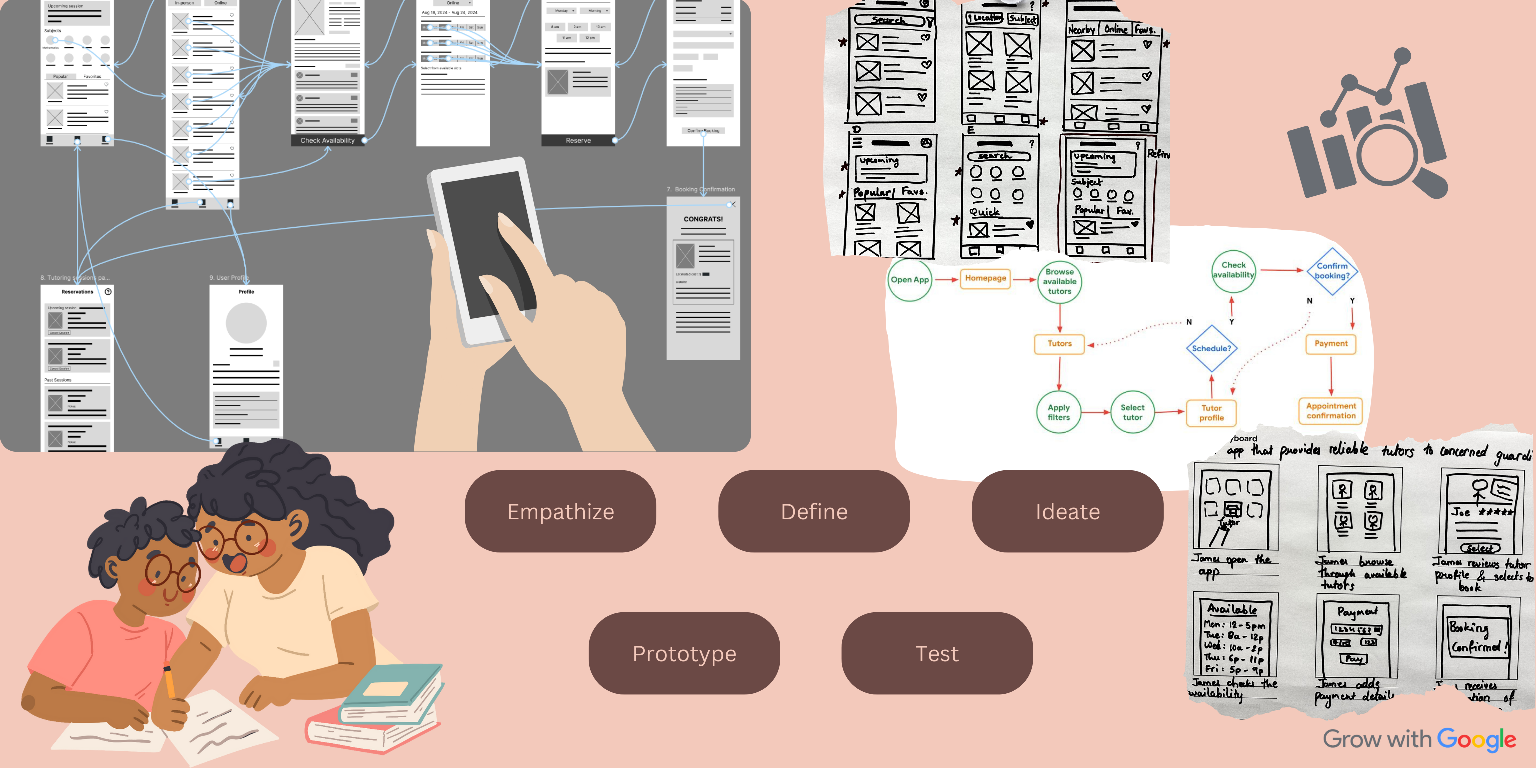
TutorReserve Mobile App Design
Designing a seamless experience for parents/guardians to find and book reliable tutors.
The Product
TutorReserve is a booking application designed to help parents and guardians find reliable tutors based on their child’s specific needs. Typical users range from 25 to 60 years old, consisting of busy parents balancing work and home life, as well as guardians caring for children.
Project Duration
4 weeks (August 2024 – September 2024)
The Problem
There is a lack of easy access to trustworthy local tutors, and finding a schedule that works for both parents and tutors can be a challenge.
The Goal
Design a mobile application that allows users to find reliable tutors with flexible schedules. The booking process should be intuitive and simple to navigate.
My Role
Lead UX designer and researcher
Responsibilities
User research, conducting interviews, paper and digital wireframing, low- and high-fidelity prototyping, conducting usability studies, ensuring accessibility, iterating on designs, and creating responsive designs.
User Research: Summary
I conducted secondary research due to time constraints and limited access to potential interviewees. I gathered insights from online sources like forums, reviews of existing tutoring platforms, and tools like ChatGPT. Initially, I assumed that parents’ primary concerns would revolve around cost and convenience, while tutors would focus on expanding their client base. However, I found that safety, trustworthiness, and flexible scheduling were equally significant for both groups.
User Research: Pain Points
Finding Qualified Tutors
Parents struggle to find tutors who match their child’s learning style and academic needs. A robust search and filtering system would allow users to filter tutors by qualifications, subjects, and teaching styles.
Safety and Reliability Concerns
Parents are concerned about safety and tutor credibility. Incorporating verified profiles, background checks, and reviews can build trust between parents and tutors.
Inconsistent Tutor Availability
Tutors face challenges with inconsistent bookings. A flexible scheduling system allows tutors to manage their availability while promoting their services within the app.
Accessibility and Payment
Both parents and tutors experience difficulties with scheduling and payment. A secure and integrated payment system would streamline these processes.
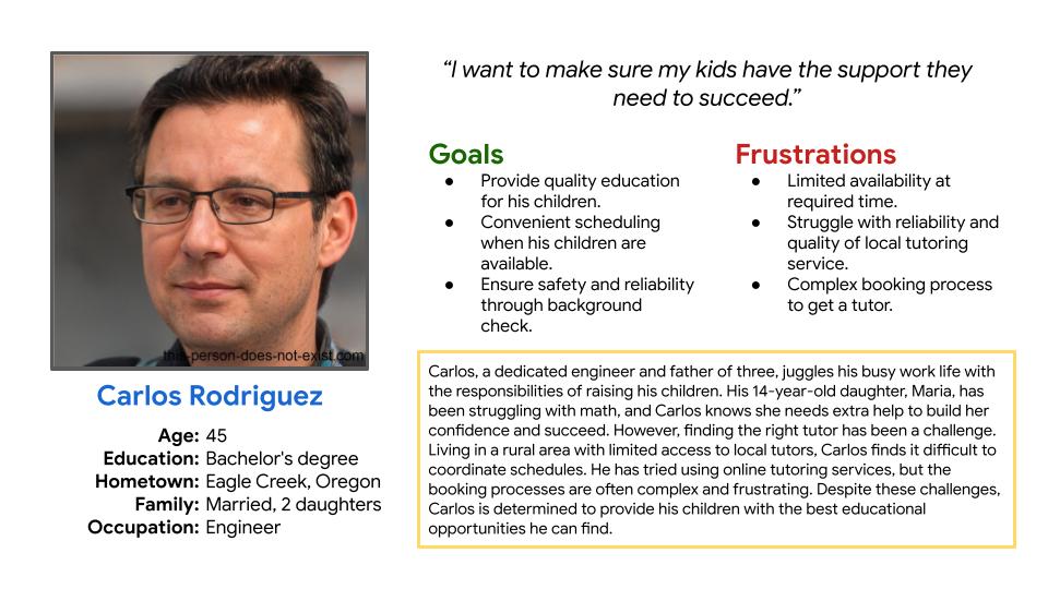
Persona: Carlos Rodriguez
Problem Statement
Carlos is a father who needs to find a reliable tutor and book sessions for his children, but faces limited availability of qualified tutors.
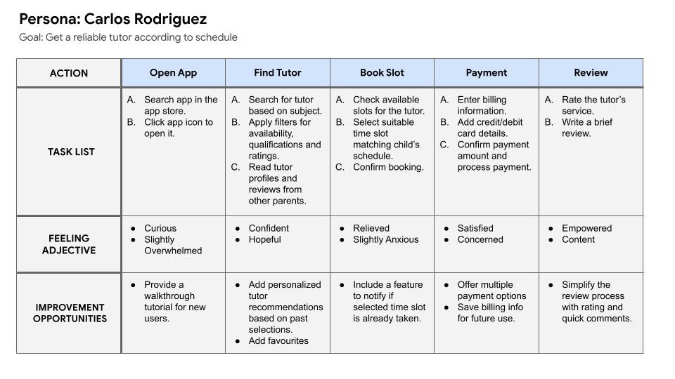
User Journey Map
Mapping out Carlos’s journey highlighted the need for a user-friendly interface that simplifies the process of finding and booking tutors, as well as the importance of a secure payment system to build trust.
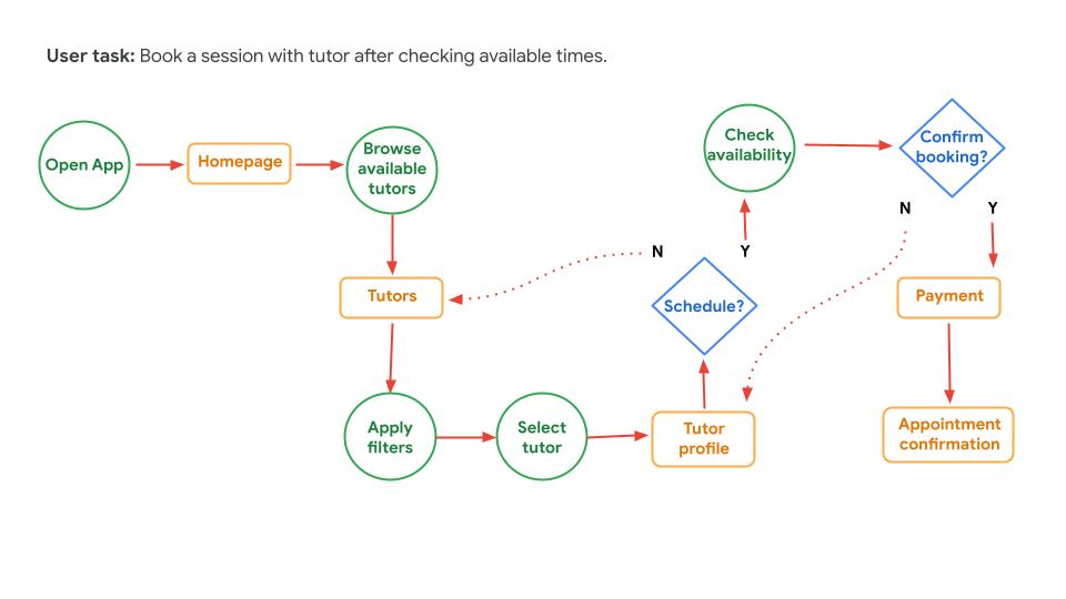
User Flow Diagram
A user flow visually maps out the steps a user takes to interact with TutorReserve. It helps illustrate key actions, decision points, and the screens users will encounter.

Storyboards
Big-Picture Storyboard
The big-picture storyboard focuses on the users’ broader needs, showing how TutorReserve helps parents like Carlos in real-world scenarios, ensuring convenience and trust.
Close-Up Storyboard
The close-up storyboard offers a detailed view of the app’s interface, highlighting key interactions such as tutor browsing, booking, and payments.
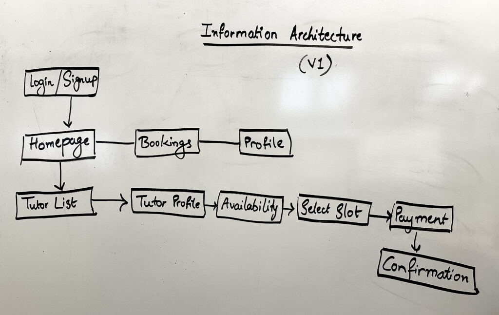
Information Architecture (IA)
The primary pain point was difficulty navigating tutor profiles and booking pages. I created an IA to strategically improve the navigation making it straightforward and intuitive.
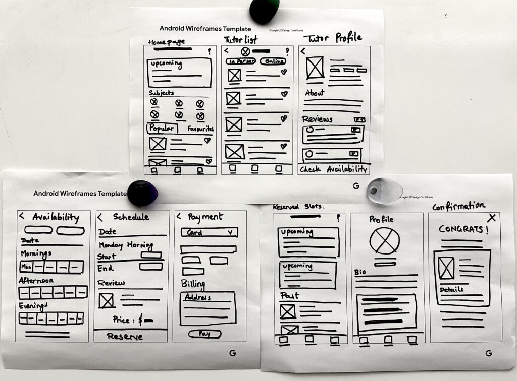
Paper Wireframes
I sketched initial paper wireframes with a focus on simplifying the navigation, improving the booking process, and making the search/filtering system accessible.
Digital Wireframes
Transitioning from paper to digital wireframes provided clarity on how design adjustments could address user pain points. I prioritized clear visual hierarchy, easy button placement, and improved layout for better user flow.


Low-Fidelity Prototype
I connected the screens to create a low-fidelity prototype that demonstrated the primary user flow: browsing for a tutor, selecting a date and time to book the session, and payment. Feedback from peers and colleagues highlighted button placement and organization improvements, which I incorporated into the design.
Usability Study: Findings
The usability study revealed key insights for improving user experience:
Session
Users requested an option to modify the booked session
Scheduling
Users wanted the ability to schedule recurring sessions more easily.
Navigation
Some users were confused by the layout during the booking process

Updating Wireframes
Booking Process
I combined the day and time selection into a single page to simplify the slot selection process. This reduced confusion and improved the user experience.
Recurring Sessions
I added a checkbox for recurring bookings, allowing users to easily schedule multiple sessions without repeating the process.
Transition to Mockup
This image shows how the wireframe layout was converted to a high-fidelity mockup with rich typography, colors, iconography, and elevation; along with a responsive layout.

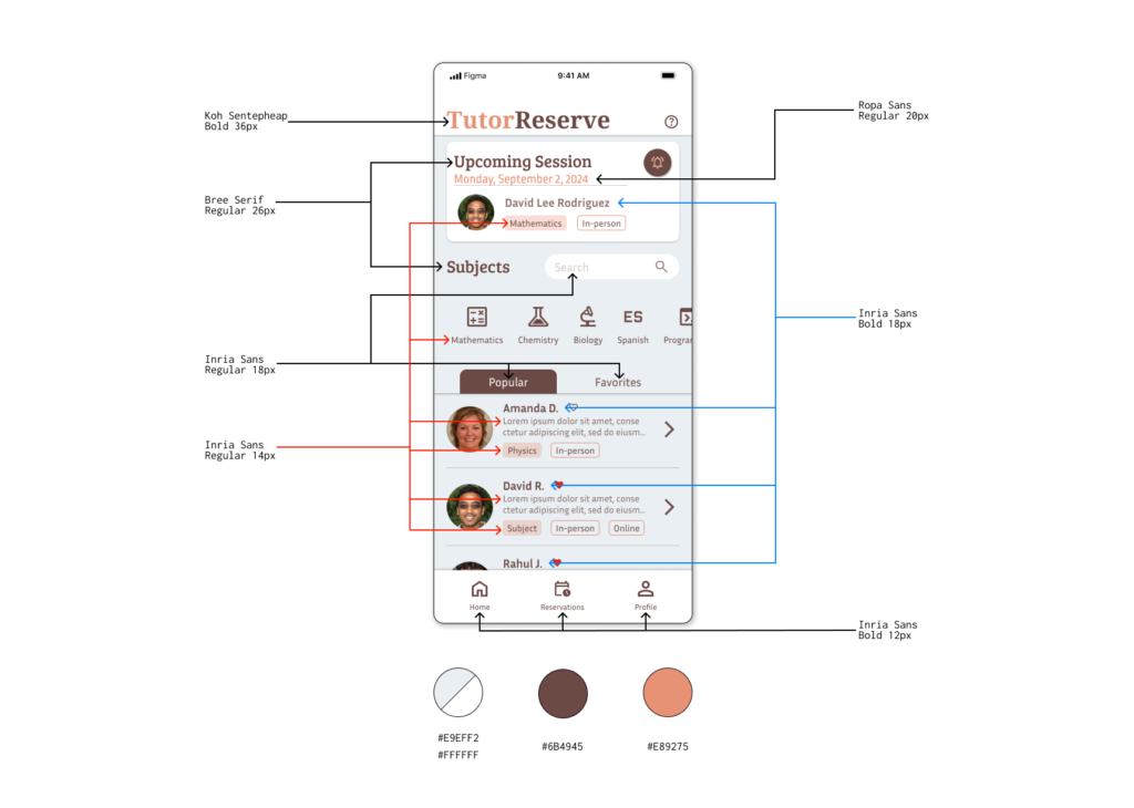
Design Style
This image shows the typography and color palette selection details
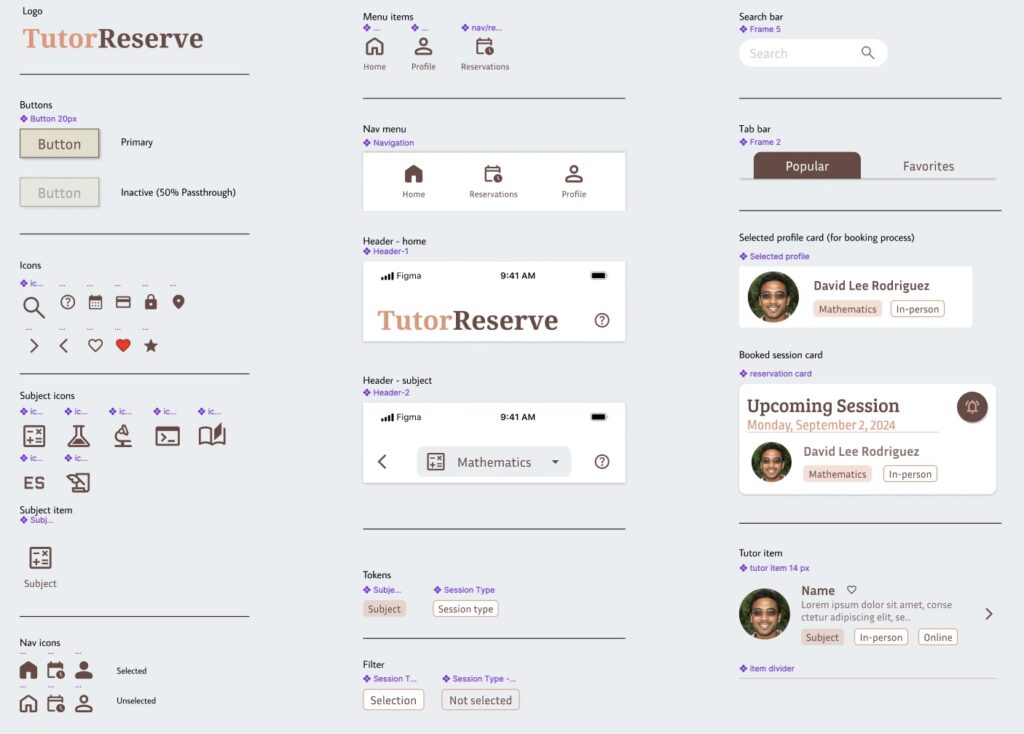
Design System: Sticker Sheet
I saved reusable elements as components, making future updates easier. Using instances of components allowed for consistent design and quick changes across all screens, improving efficiency and maintaining cohesion.

High-Fidelity Prototype
The high-fidelity prototype reflected the findings from usability testing, integrating all design improvements, including simplified navigation and improved accessibility features.
Accessibility Considerations
Clear Visual Hierarchy
I used appropriately sized headings to establish a clear visual hierarchy for better readability.
Landmarks for Navigation
Incorporating landmarks made the app more accessible for users relying on assistive technologies.
Color Contrast
Strong color contrast ensured that users with visual impairments could navigate the app with ease.
Takeaways
Impact
Users appreciated the intuitive booking process and the ability to find local tutors through the app. The streamlined scheduling system and easy navigation significantly improved their experience.
What I Learned
Even small design changes can have a large impact on user satisfaction. By focusing on the real needs of users, I learned to create design solutions that cater to both parents’ concerns about safety and tutors’ need for flexible scheduling.
Next Steps
Follow-up Usability Testing
Conduct further testing on the updated mockups to ensure the improvements meet user needs.
New Features
Incorporate additional options, such as specifying days for recurring bookings.
Web Version
Create a web version of the app to provide easy access without the need for downloading an app.
GET IN TOUCH
Available for questions, collaborations, projects, or even a coffee chat!
